JOS MAYNE JER
The design criteria here was to increase the square footage, renovate the existing, install a pool, and to retain as much yard as possible. Tall order!? The goals where achieved by removing the wood floors and quarrying out the stone below them. This gave us a stone to sell and to use on site, and a clean cut finish along the earthen walls of the new lower level.
The final design includes a Lower Entertainment Space with the Pool adjacent; completely separate from the Main House above. This proved to be a very important feature for the couple who have young kids, but still enjoy the company of friends.


DESIGN WITHOUT GOOD INFORMATION INVARIABLY RESULTS IN FICTION. I DON'T KNOW HOW COHERENCE CAN POSSIBLY BE ACHIEVED WITHOUT CONTEXT.
jeremy o. johnson

This was an opportunity to play the role of a re-branding partner of a very established Bermuda business. The space was expected to be clean and minimal so the products could be displayed with maximum impact. We also needed to (in some small way) pay homage to the progenitor of the company who was known to love sailing.
This was accomplished together with the contractor, by creating a catalog bookshelf likened to the gunnel of a boat piercing the wall to create a reading counter above. Additional mariner motifs, a simple palette, and shade exhibit boxes ensure that every goal was met without compromise to product display.

NEW WAREHOUSE SPACE
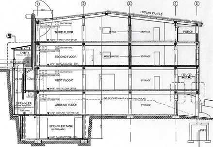
We were presented with a sloping Industrial site, and given the mandate to create what would make the most profits. The answer was a 4 story warehouse with over 18,000 square feet of storage and office space. The slope gave us the ability to enter three of the levels at grade, with the upper-most floor being accessed via stair and a roller door for fork lift access. This eliminated the expense of an elevator which would eat up floor area on every level. We also paid our respects to the neighbors to the north with a more residential treatment to that elevation. The design was successful, and represents proof that Architecture does not need to take a back seat when the goal is simply to maximize profits.
.png)


